

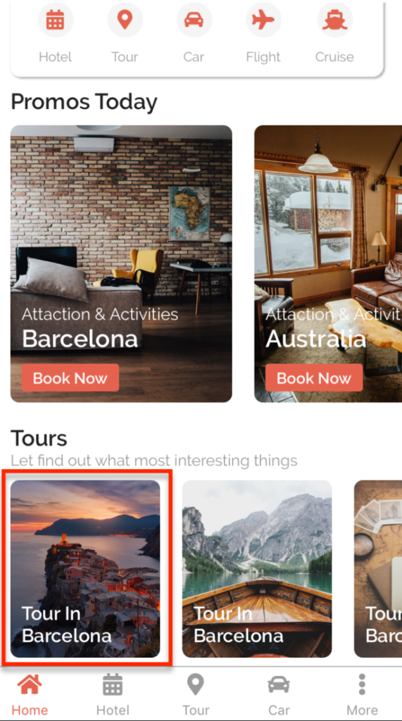
Card is a pure NativeBase component. Card is a flexible and extensible content container. It includes image and content inside
Usage
<Card
    style={[
        styles.tourItem,
        index == 0
            ? { marginHorizontal: 20 }
            : { marginRight: 20 }
    ]}
    image={item.image}
    onPress={() =>
        navigation.navigate("TourDetail")
    }
>
    <Text headline whiteColor semibold>
        {item.name}
    </Text>
</Card>
Props
image
Type: String | Required
Path of image display on card
style
Type: StyleProp
Customize CSS style ViewStyle
styleContent
Type: StyleProp
Customize CSS style of content wrapping text
onPress
Type: Function
Function will be called when pressed