

Buttons are additionally styled TouchableOpacity components.
Usage
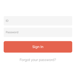
import { Button } from "@components";

<Button full
    style={{ marginTop: 20 }}
    onPress={() => {
        console.log("Login");
    }}
>
    Sign In
</Button>
Props
full
Type: Boolean
Adding full to a button will make the button take 100% of its parent’s width
round
Type: Boolean
Easily style your buttons with slightly rounded edges
outline
Type: Boolean
Apply outline button style
outline
Type: Boolean
Apply outline button style
icon
Type: Node
Add icon to button with Icon component
style
Type: StyleProp
Customize CSS style ViewStyle
loading
Type: Boolean
Loading state with loading indicator
onPress
Type: Function
Function will be called when pressed