

Font Family
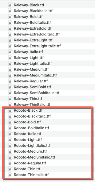
The default font family name “Raleway” are being used for this template. If you need change or a custom font to be the prettiest? You’ll need the .ttf files for all supported styles (thin, ultraLight, light, regular, medium, semibold, bold, heavy, black …). Here are the few steps you need to add it.
Add more font family in folder ./app/assets/fonts/..
Example: Download and add more font Roboto [download here]
After added new font, open your terminal and run
react-native link
Change default font name (You can keep default font and add more prop with new font). Open file ./app/config/typography.js
export const FontFamily = {
    default: "Roboto"
};
Color
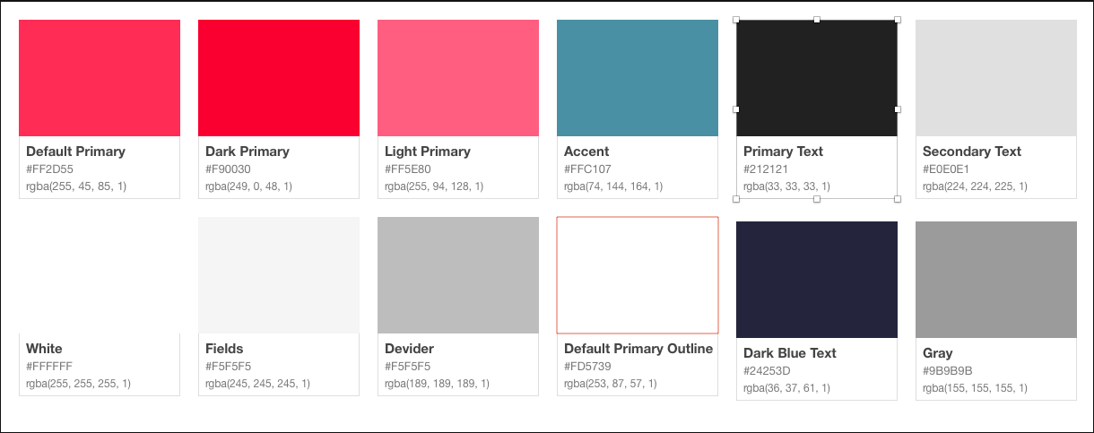
The template are using color palette following format by image below
You can change the theme prop dynamically and all the components will automatically update to reflect the new theme. Open file ./app/config/color.js
export const BaseColor = {
    primaryColor: "#FF2D55", // primary color for your app, usually your brand color.
    darkPrimaryColor: "#F90030", // color is darker base on BaseColor.primaryColor
    lightPrimaryColor: "#FF5E80", // // color is lighter base on BaseColor.primaryColor
    accentColor: "#4A90A4", // secondary color for your app which complements the primary color.
    textPrimaryColor: "#212121", // text color for content.
    textSecondaryColor: "#E0E0E1", // text color for content.
    grayColor: "#9B9B9B", // gray color, just common using for app
    darkBlueColor: "#24253D", // dark blue color, just common using for app
    dividerColor: "#BDBDBD", // color for separator
    whiteColor: "#FFFFFF", // white color
    fieldColor: "#F5F5F5", // common field color like input, text area
    yellowColor: "#FDC60A", // just another color use for the app
    navyBlue: "#3C5A99" // just another color use for the app
};
The main color palettes following properties:
- BaseColor (object)
- primaryColor
- darkPrimaryColor
- lightPrimaryColor
- accentColor
- textPrimaryColor
- textSecondaryColor
If you want to customize colors or for matching with your business colors. Just refer more with websites below for pickup right color palettes
Typography
To maintain clean and consistent typography your application, we support define main StyleSheet following ./app/config/typography.js
export const Typography = StyleSheet.create({
    header: {
        fontSize: 34,
        fontWeight: FontWeight.regular,
        fontFamily: FontFamily.default
    },
    title1: {
        fontSize: 28,
        fontWeight: FontWeight.regular,
        fontFamily: FontFamily.default
    },
    title2: {
        fontSize: 22,
        fontWeight: FontWeight.regular,
        fontFamily: FontFamily.default
    },
    title3: {
        fontSize: 20,
        fontWeight: FontWeight.regular,
        fontFamily: FontFamily.default
    },
    headline: {
        fontSize: 17,
        fontWeight: FontWeight.regular,
        fontFamily: FontFamily.default
    },
    body1: {
        fontSize: 17,
        fontWeight: FontWeight.regular,
        fontFamily: FontFamily.default
    },
    body2: {
        fontSize: 14,
        fontWeight: FontWeight.regular,
        fontFamily: FontFamily.default
    },
    callout: {
        fontSize: 17,
        fontWeight: FontWeight.regular,
        fontFamily: FontFamily.default
    },
    subhead: {
        fontSize: 15,
        fontWeight: FontWeight.regular,
        fontFamily: FontFamily.default
    },
    footnote: {
        fontSize: 13,
        fontWeight: FontWeight.regular,
        fontFamily: FontFamily.default
    },
    caption1: {
        fontSize: 12,
        fontWeight: FontWeight.regular,
            fontFamily: FontFamily.default
        },
        caption2: {
            fontSize: 11,
            fontWeight: FontWeight.regular,
            fontFamily: FontFamily.default
        },
        overline: {
            fontSize: 10,
            fontWeight: FontWeight.regular,
            fontFamily: FontFamily.default
        }
    });
How to use common StyleSheet for other StyleSheet ?
import { BaseColor, Typography, FontWeight } from "@config";
export default StyleSheet.create({
    textDefault: {
        ...Typography.headline, // Typography > headline
        color: BaseColor.whiteColor,
        fontWeight: FontWeight.semibold
    }
);
FontWeight
To maintain clean and consistent font weight your application, we support define common font weight following ./app/config/typography.js
export const FontWeight = {
    thin: "100",
    ultraLight: "200",
    light: "300",
    regular: "400",
    medium: "500",
    semibold: "600",
    bold: "700",
    heavy: "800",
    black: "900"
};
How to use common FontWeight for other StyleSheet ?
import { BaseColor, Typography, FontWeight } from "@config";
export default StyleSheet.create({
    textDefault: {
        ...Typography.headline,
        color: BaseColor.whiteColor,
        fontWeight: FontWeight.semibold // FontWeight > semibold
    }
);