Felix Travel
Version 1.0.6
Version 1.0.6
Copyright Moonart 2015
made with the Documenter v1.0
made with the Documenter v1.0
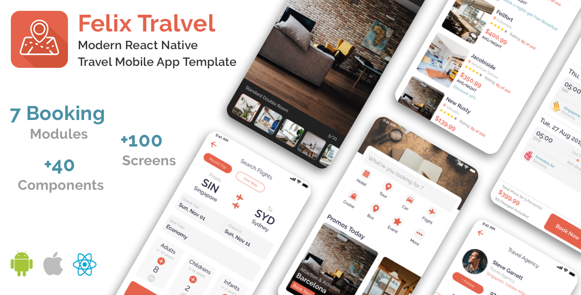
Firstly, a huge thanks for purchasing this template, your support is truly appreciated!
This document covers the installation and use of this template and often reveals answers to common
problems
and issues - read this document thoroughly if you are experiencing any difficulties. If you have any
questions that are beyond the scope of this document, feel free to pose them in the dedicated support section.
Available download from App Store & Google Play
Android: https://play.google.com/store/apps/details?id=com.felixpro
IOS: https://apps.apple.com/us/app/felixpro/id1474371512
Account Test: demo/demo
Go ahead to know more.
			brew install node
			brew install watchman
npm install -g react-native-cli
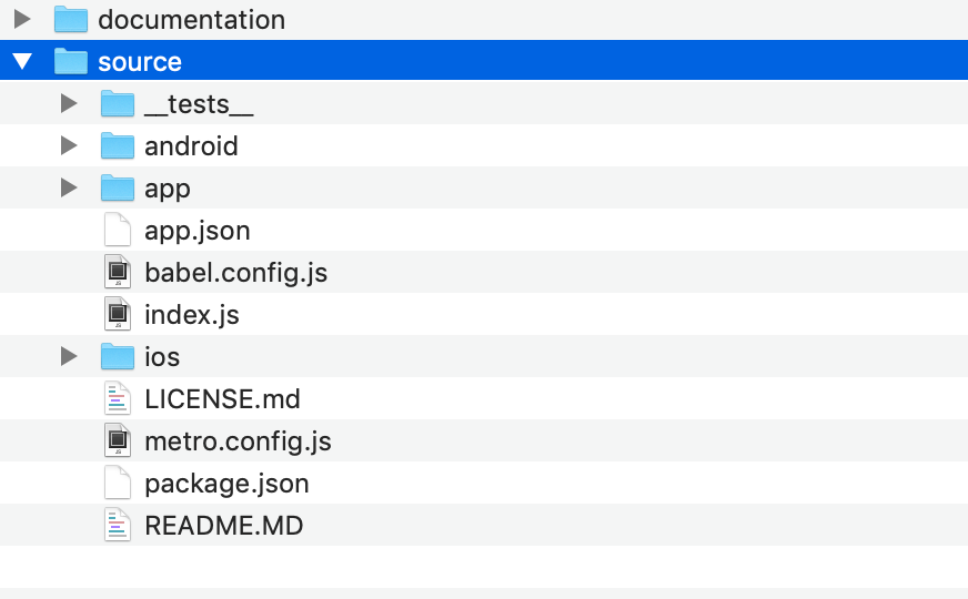
After unzip the download pack, you'll find a source with all the files. Open a Terminal in source and run
npm installInstall cocoapods
				sudo gem install cocoapods
				cd ./ios
				pod update
				pod install
Link fonts and resource icons
npx react-native linkStart a development server
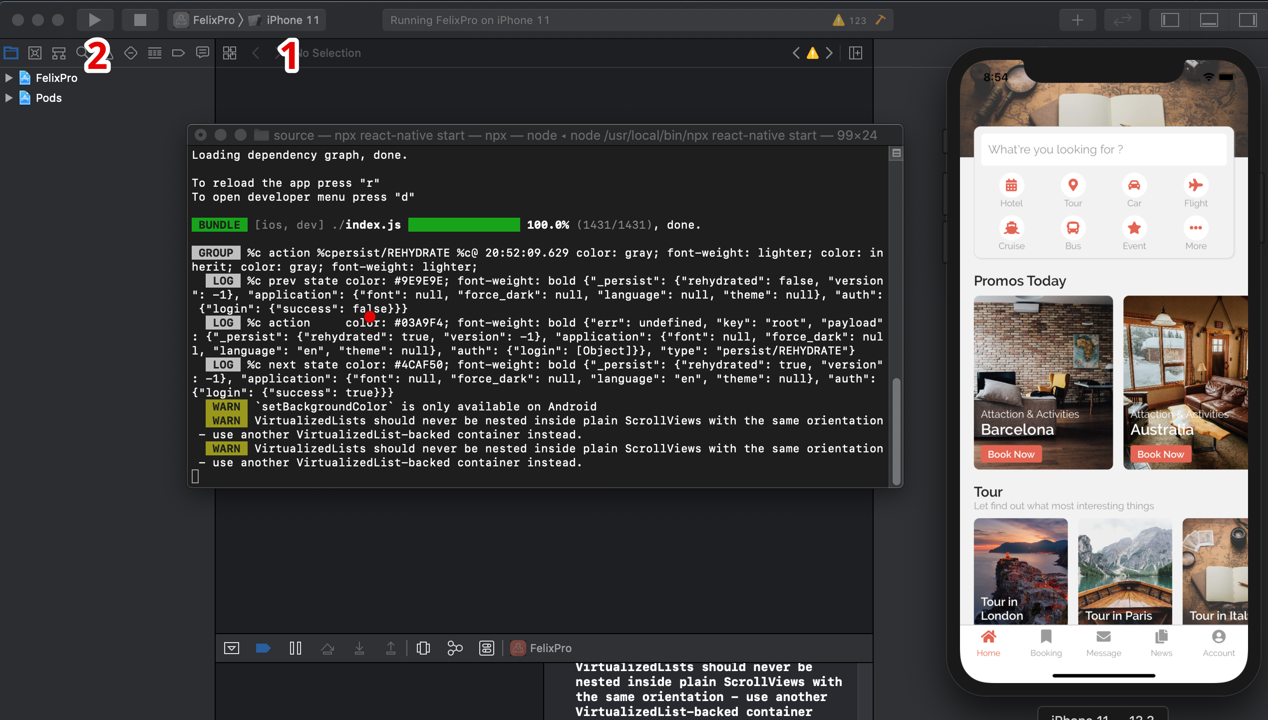
				open -a Simulator
				npx react-native start
Using your Xcode and open file
./source/ios/FelixPro.xcworkspace
1. Select your simulator device
2. Build project with simulator and your enjoy your development
Before getting started, please read thoroughly this React Native official docs for how prepare with Android development https://facebook.github.io/react-native/docs/getting-started
After you finished setup for Android, we will move to next step
Install node modules
npm installLink fonts and resource icons
npx react-native linkStart a development server
npx react-native start
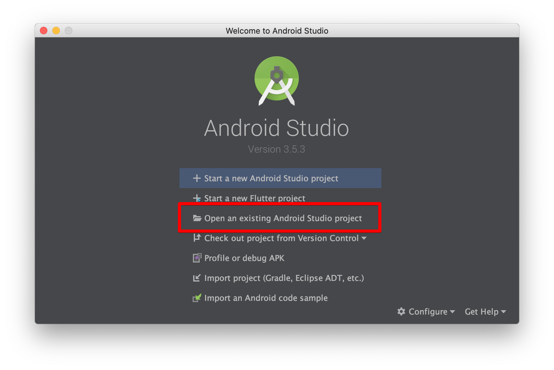
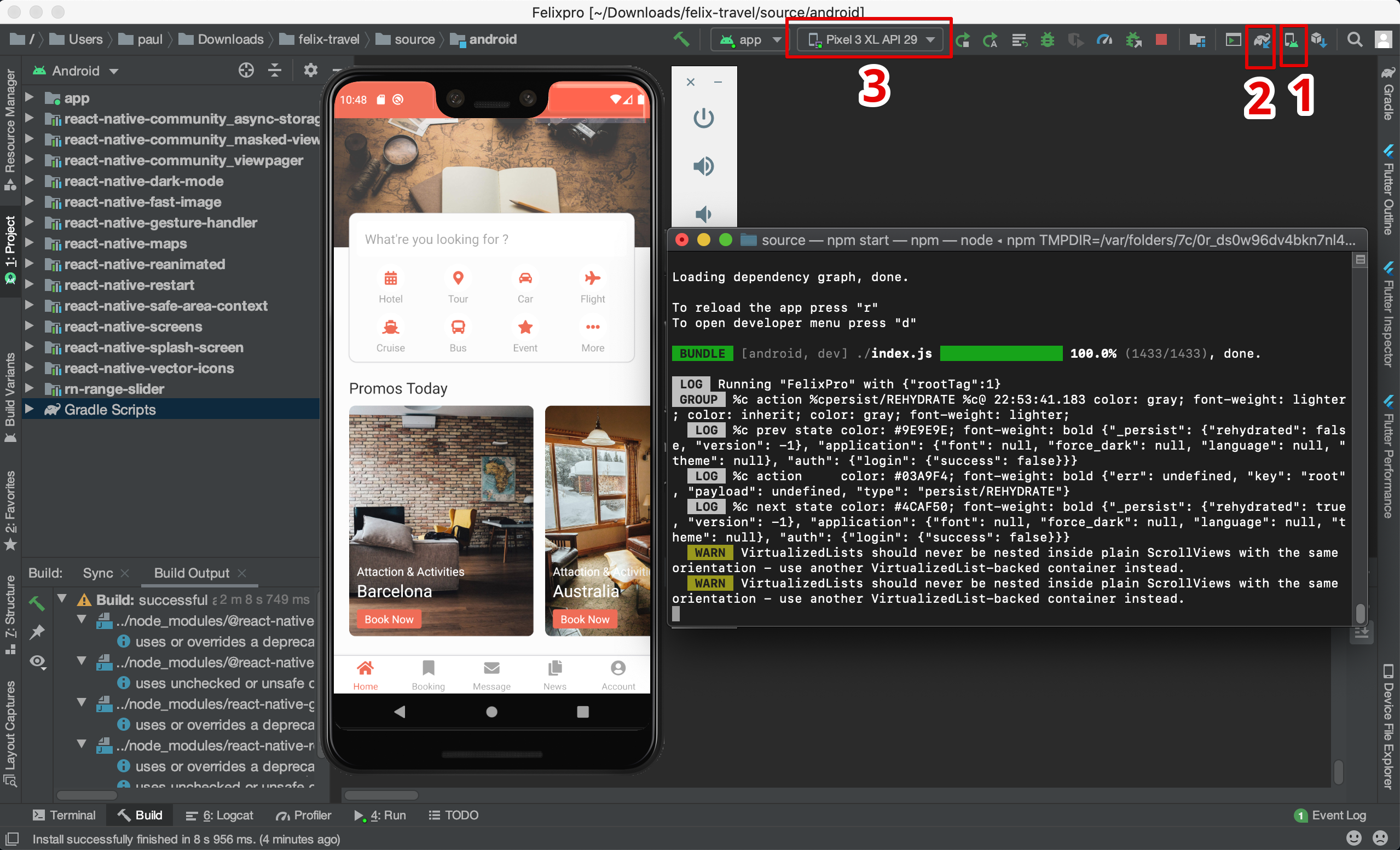
Using your Android Studio (3.6.1 or last version)
and
build project with folder ./source/android
- Step 1: ADM Manager - Install your virtual devices for use
- Step 2: Sync project with Gradle files
- Step 3: Select virtual device and Run your application
./app/config/..
./app/components/..
See more how to use components ?
./app/navigation/..
./app/screens/..
./app/navigation/main.js will link with screens locate in folder
./app/screens/..
./app/assets/..
You can store images or other file resource in this folder
./app/store/index.js./app/actions/.../app/reducers/.../app/utils/..
./app/assets/fonts/..
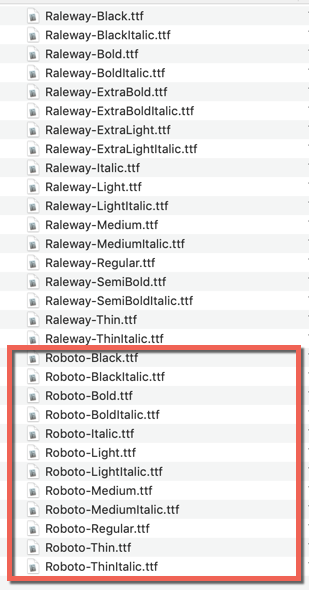
npx react-native linkChange default font name (You can keep default font and add more prop with new font).
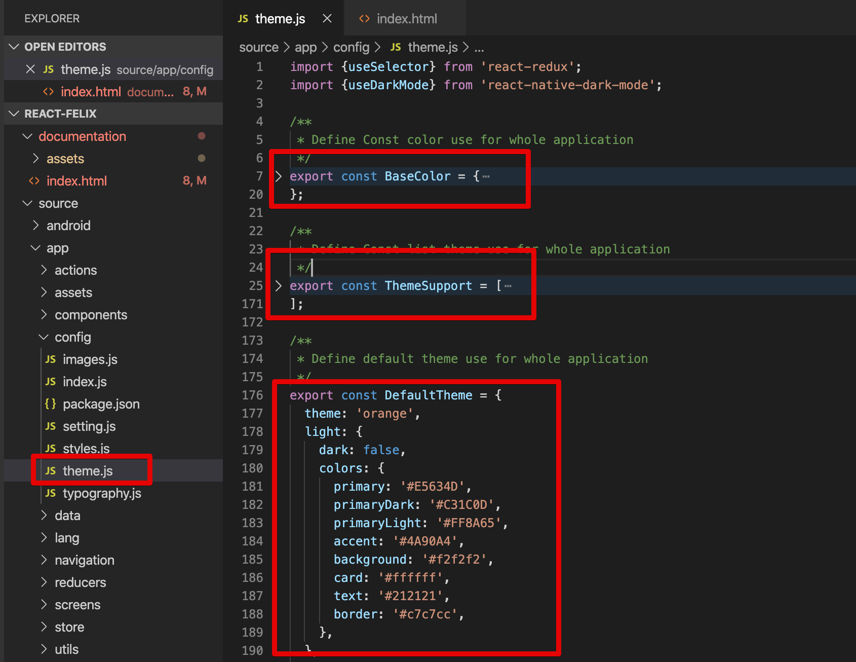
./app/config/theme.js
				// Define list font use for whole application
				export const FontSupport = ['Raleway', 'Roboto', 'Merriweather'];

				// Define font default use for whole application
				export const DefaultFont = 'Raleway';
You can change the theme prop dynamically and all the components will automatically update to reflect the new theme.
Open file ./app/config/theme.js
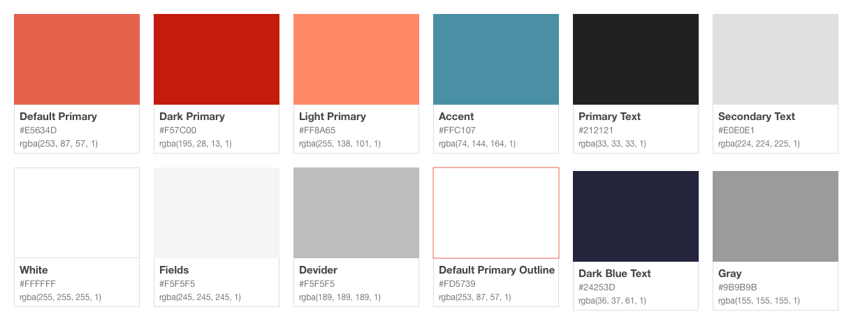
				export const BaseColor = {
					primaryColor: "#E5634D", // primary color for your app, usually your brand color.
					darkPrimaryColor: "#C31C0D", // color is darker base on BaseColor.primaryColor
					lightPrimaryColor: "#FF8A65", // // color is lighter base on BaseColor.primaryColor
					accentColor: "#4A90A4", // secondary color for your app which complements the primary color.
					textPrimaryColor: "#212121", // text color for content.
					textSecondaryColor: "#E0E0E1", // text color for content.
					grayColor: "#9B9B9B", // gray color, just common using for app
					darkBlueColor: "#24253D", // dark blue color, just common using for app
					dividerColor: "#BDBDBD", // color for separator
					whiteColor: "#FFFFFF", // white color
					fieldColor: "#F5F5F5", // common field color like input, text area
					yellowColor: "#FDC60A", // just another color use for the app
					navyBlue: "#3C5A99" // just another color use for the app
				};
The main color palettes following properties:
				export const ThemeSupport = [
					{
						theme: 'orange',
						light: {
						dark: false,
						colors: {
							primary: '#E5634D',
							primaryDark: '#C31C0D',
							primaryLight: '#FF8A65',
							accent: '#4A90A4',
							background: '#f2f2f2',
							card: '#ffffff',
							text: '#212121',
							border: '#c7c7cc',
						},
						},
						dark: {
						dark: true,
						colors: {
							primary: '#E5634D',
							primaryDark: '#C31C0D',
							primaryLight: '#FF8A65',
							accent: '#4A90A4',
							background: '#010101',
							card: '#121212',
							text: '#e5e5e7',
							border: '#272729',
						},
						},
					},
					...
				]
				export const DefaultTheme = {
					theme: 'orange',
					light: {
					  dark: false,
					  colors: {
						primary: '#E5634D',
						primaryDark: '#C31C0D',
						primaryLight: '#FF8A65',
						accent: '#4A90A4',
						background: '#f2f2f2',
						card: '#ffffff',
						text: '#212121',
						border: '#c7c7cc',
					  },
					},
					dark: {
					  dark: true,
					  colors: {
						primary: '#E5634D',
						primaryDark: '#C31C0D',
						primaryLight: '#FF8A65',
						accent: '#4A90A4',
						background: '#010101',
						card: '#121212',
						text: '#e5e5e7',
						border: '#272729',
					  },
					},
				  };
./app/config/typography.js
				export const Typography = StyleSheet.create({
					header: {
						fontSize: 34,
						fontWeight: FontWeight.regular,
						fontFamily: FontFamily.default
					},
					title1: {
						fontSize: 28,
						fontWeight: FontWeight.regular,
						fontFamily: FontFamily.default
					},
					title2: {
						fontSize: 22,
						fontWeight: FontWeight.regular,
						fontFamily: FontFamily.default
					},
					title3: {
						fontSize: 20,
						fontWeight: FontWeight.regular,
						fontFamily: FontFamily.default
					},
					headline: {
						fontSize: 17,
						fontWeight: FontWeight.regular,
						fontFamily: FontFamily.default
					},
					body1: {
						fontSize: 17,
						fontWeight: FontWeight.regular,
						fontFamily: FontFamily.default
					},
					body2: {
						fontSize: 14,
						fontWeight: FontWeight.regular,
						fontFamily: FontFamily.default
					},
					callout: {
						fontSize: 17,
						fontWeight: FontWeight.regular,
						fontFamily: FontFamily.default
					},
					subhead: {
						fontSize: 15,
						fontWeight: FontWeight.regular,
						fontFamily: FontFamily.default
					},
					footnote: {
						fontSize: 13,
						fontWeight: FontWeight.regular,
						fontFamily: FontFamily.default
					},
					caption1: {
						fontSize: 12,
						fontWeight: FontWeight.regular,
							fontFamily: FontFamily.default
						},
						caption2: {
							fontSize: 11,
							fontWeight: FontWeight.regular,
							fontFamily: FontFamily.default
						},
						overline: {
							fontSize: 10,
							fontWeight: FontWeight.regular,
							fontFamily: FontFamily.default
						}
					});
How to use common StyleSheet for other StyleSheet ?
				import { BaseColor, Typography, FontWeight } from "@config";
				export default StyleSheet.create({
					textDefault: {
						...Typography.headline, // Typography > headline
						color: BaseColor.whiteColor,
						fontWeight: FontWeight.semibold
					}
				);
./app/config/typography.js
				export const FontWeight = {
					thin: "100",
					ultraLight: "200",
					light: "300",
					regular: "400",
					medium: "500",
					semibold: "600",
					bold: "700",
					heavy: "800",
					black: "900"
				};
How to use common FontWeight for other StyleSheet ?
				import { BaseColor, Typography, FontWeight } from "@config";
				export default StyleSheet.create({
					textDefault: {
						...Typography.headline,
						color: BaseColor.whiteColor,
						fontWeight: FontWeight.semibold // FontWeight > semibold
					}
				);
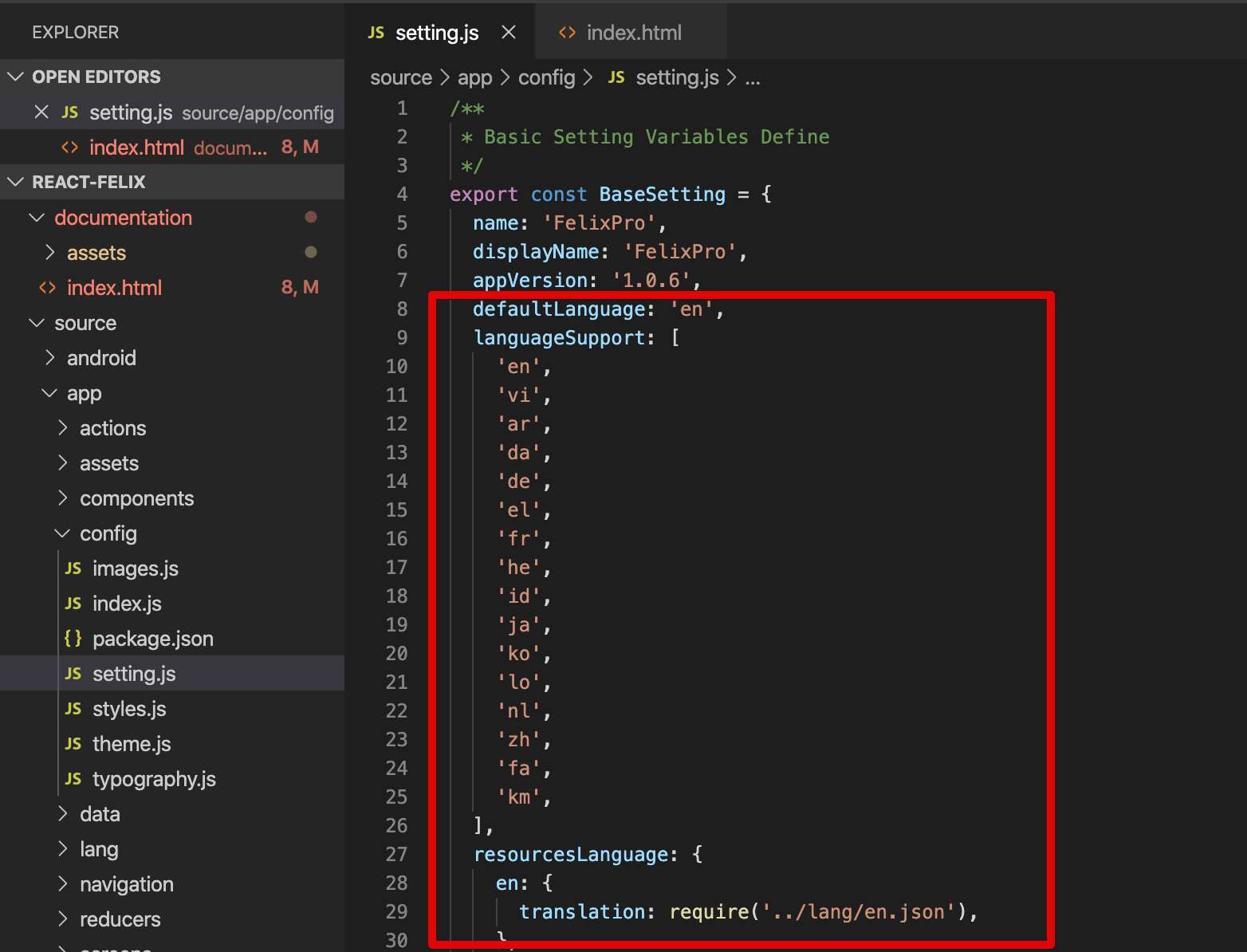
- First, please check file ./app/config/setting.js and define your list language support
- Folder ./app/lang/.. is contains language file and formatted with json data
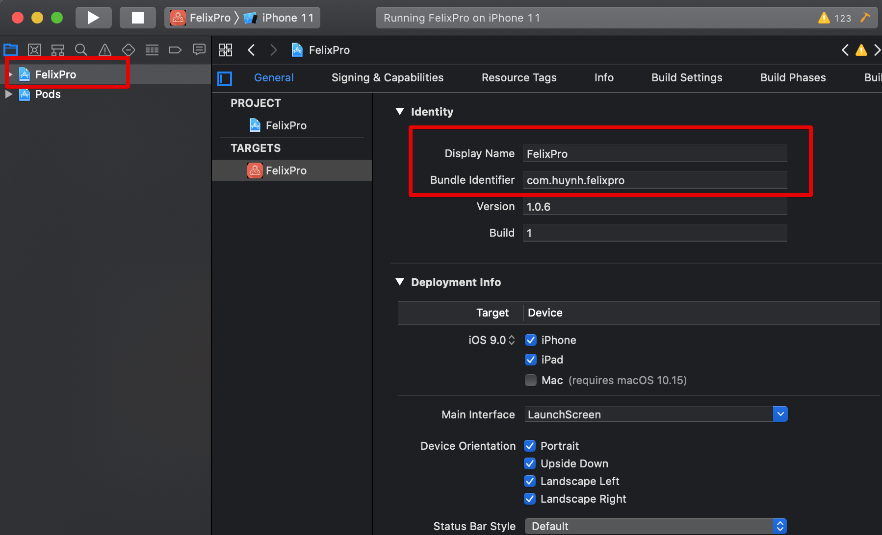
This project also allow change application name & icon
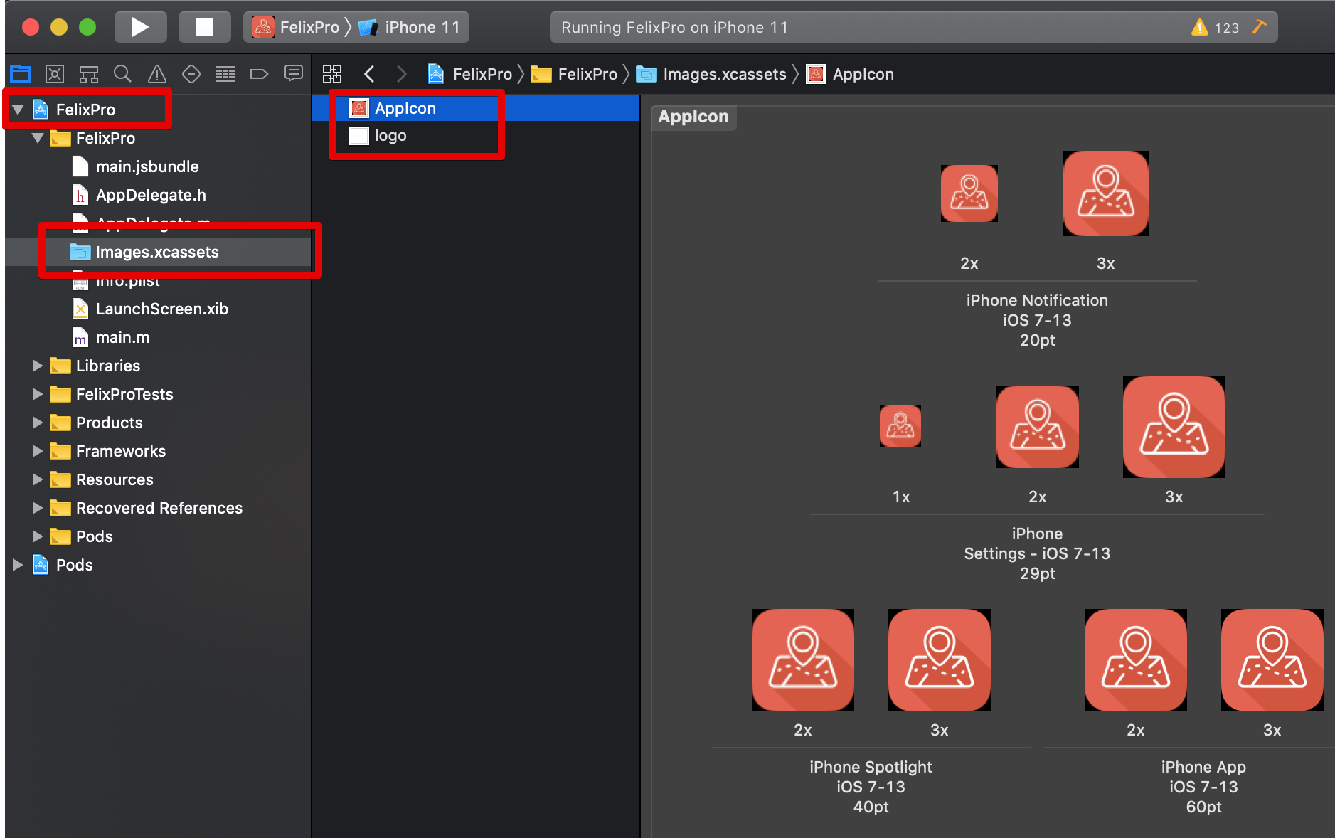
IOS
Open file ./ios/FelixPro/Info.plist and replace the FelixPro with your app branch
name and also search keyword "FelixPro" in folder ./source/android/app/ for replacement
				CFBundleDisplayName
				FelixPro
Android
Open file ./source/android/app/src/main/res/values/strings.xml
and replace FelixPro with your app name
FelixPro
IOS
Using Xcode and open ios project then modify it
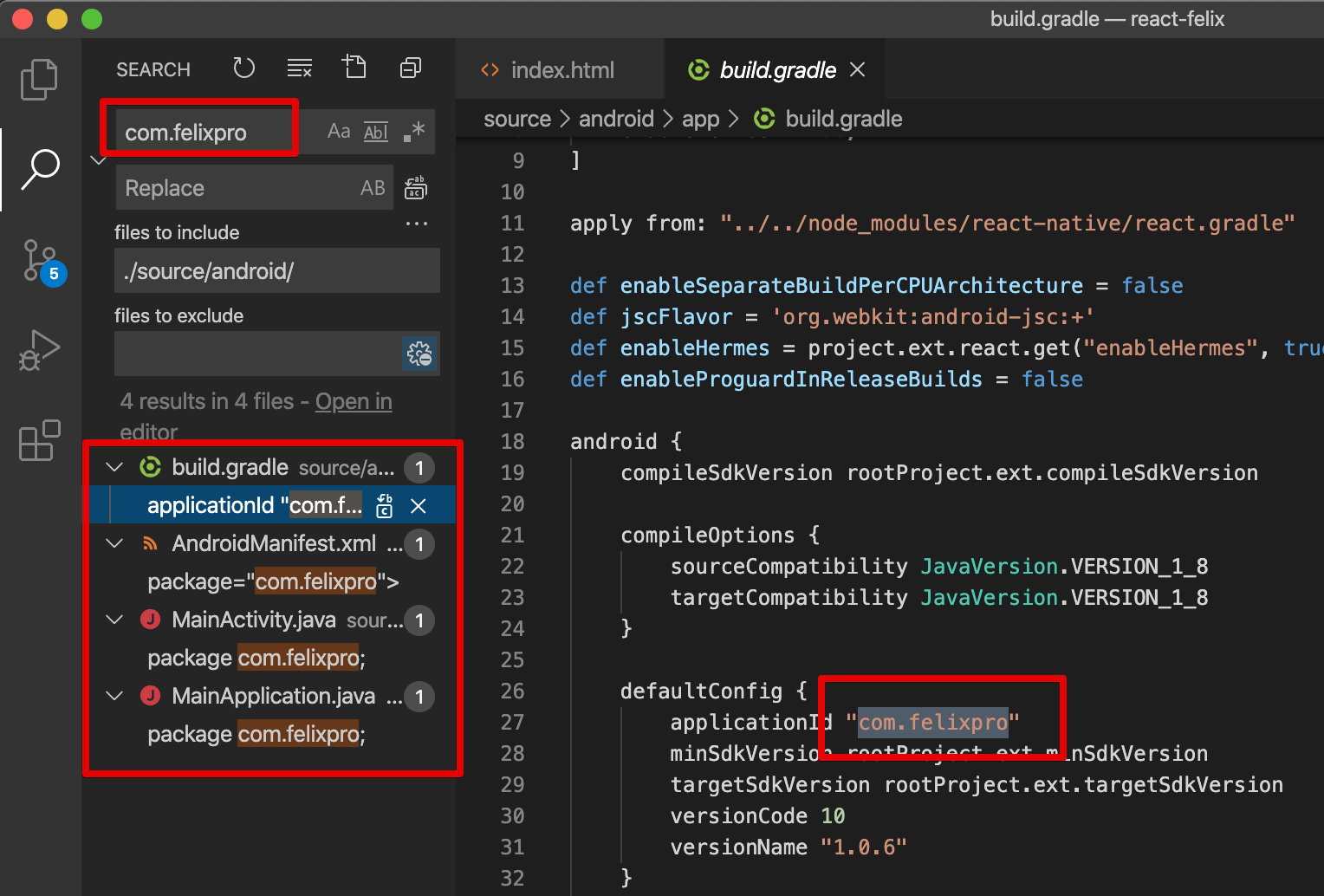
Android
Searching "com.huynh.listar_flutter" in folder ./android/... then modify it
IOS
Android
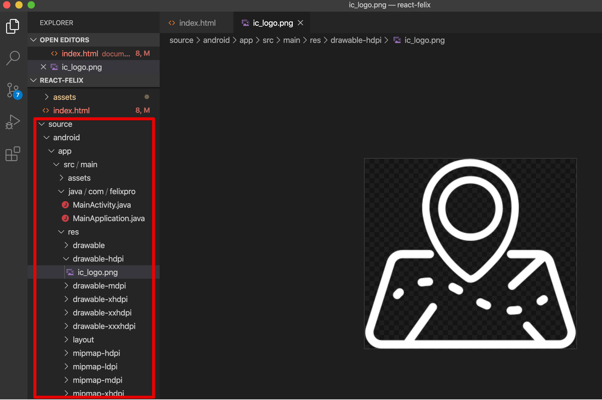
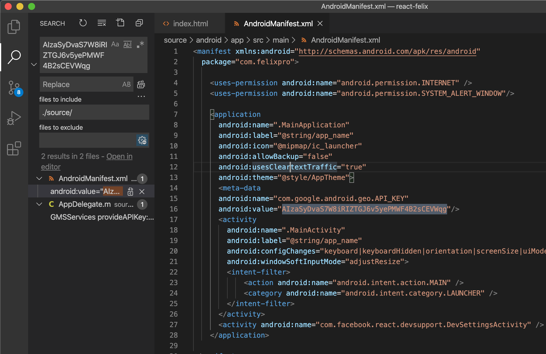
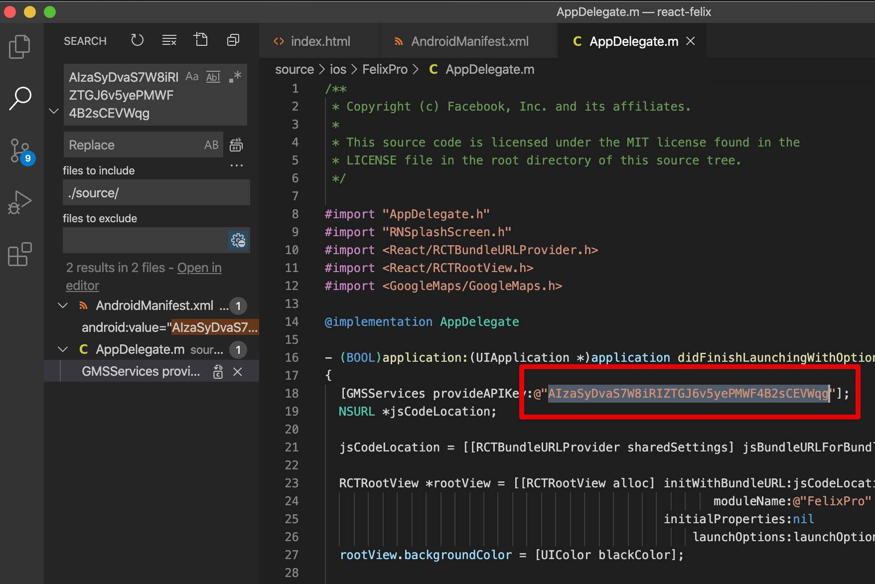
First please check how to register GoogleMap key from https://developers.google.com/maps/documentation/embed/get-api-key
Search in project exist GoogleMap key AIzaSyDvaS7W8iRIZTGJ6v5yePMWF4B2sCEVWqg
File locate
- Ios: ./source/ios/FelixPro/AppDelegate.m
- Android: ./source/android/app/src/main/AndroidManifest.xml
Android
IOS
We already made it. You can enable to customize for fix your project requirements if you need it. just download from link below

No, It dose not. It just included template only. We do not connect any API. You have to develop by yourself for matching with your biz.
No, It dose not. The mobile template application just simple application with UI/UX.
No, It dose not. It is using pure React Native for develop. If you would like to include React NativeBase or React Native Elements ... You can do that.
Yes, as this is made by React Native framework which support to release for both iOS and Android, please discover more the framework from https://facebook.github.io/react-native/docs/getting-started.html
Yes, you will get the free upgrade with more awesome features coming, please follow the change logs to see the detail update. You will get the notify email for new version update on stores.