

CardItem is a pure NativeBase component. CardItem is a flexible and extensible content container. Allow user showing car item with kind of view list/grid/block
Usage
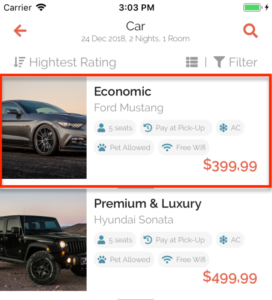
let item = {
    image: require("@assets/images/car-1.jpg"),
    title: "Economic",
    name: "Ford Mustang",
    price: "$399,99",
    per: "Day",
    rate: 4.5,
    numReviews: 100,
    services: [
        { icon: "user", name: "5 seats" },
        { icon: "history", name: "Pay at Pick-Up  " },
        { icon: "snowflake", name: "AC" },
        { icon: "paw", name: "Pet Allowed" },
        { icon: "wifi", name: "Free Wifi" }
    ]
}

<CarItem
    block
    image={item.image}
    title={item.title}
    name={item.name}
    price={item.price}
    per={item.per}
    rate={item.rate}
    numReviews={item.numReviews}
    services={item.services}
    style={{
        marginBottom
    }}
    onPress={() => {
        navigation.navigate("CarDetail");
    }}
/>
Props
style
Type: StyleProp
Customize CSS style ViewStyle
list
Type: Boolean | Default
Display item as list view
block
Type: Boolean
Display item as block view
grid
Type: Boolean
Display item as grid view
image
Type: String | Required
Path of image display on card
title
Type: String
Car class name, you can enable to display with other name purpose
name
Type: String
Main name of car
price
Type: String
Pricing of item
per
Type: String
Unit for reservation: Day, Hour, Week … etc
rate
Type: Number
Number of rating
numReviews
Type: Number
Number of user has review
services
Type: Array[{icon, name}, ….]
List of icon and name.
Icon: String (name of fontawesome)
Name: String